What the 7-District ACFR Dashboard Shows
A running series using Annual Comprehensive Financial Reports (ACFRs) to track what districts actually spent, how costs are shifting over time, and what those changes mean for student-centered outcomes.

Part 1
Cost Per Pupil, Instruction, Administration, and General Admin
- Defines what the ACFR is and why it is more reliable than summaries.
- Shows total cost per pupil rising across districts.
- Compares instructional vs administrative spending.
- Ranks districts across key categories.

Part 2
How Much of Each Per-Pupil Dollar Goes to Instruction
- Calculates instruction share of spending.
- Shows instruction share flat or declining.
- Explains athletics inside instruction category.
- Adjusts to show classroom learning share.

Part 3
The Ghost in the Machine
- Shows hidden cost drivers outside obvious categories.
- Explains unallocated system-level spending.
- Tracks behavior across years.
- Reveals what shapes totals behind the scenes.

Part 4
Special Education Costs
- Examines how special education spending is evolving across districts.
- Shows which cost components are driving growth.
- Compares trajectories across the seven-district dataset.
- Helps separate structural cost drivers from local policy choices.

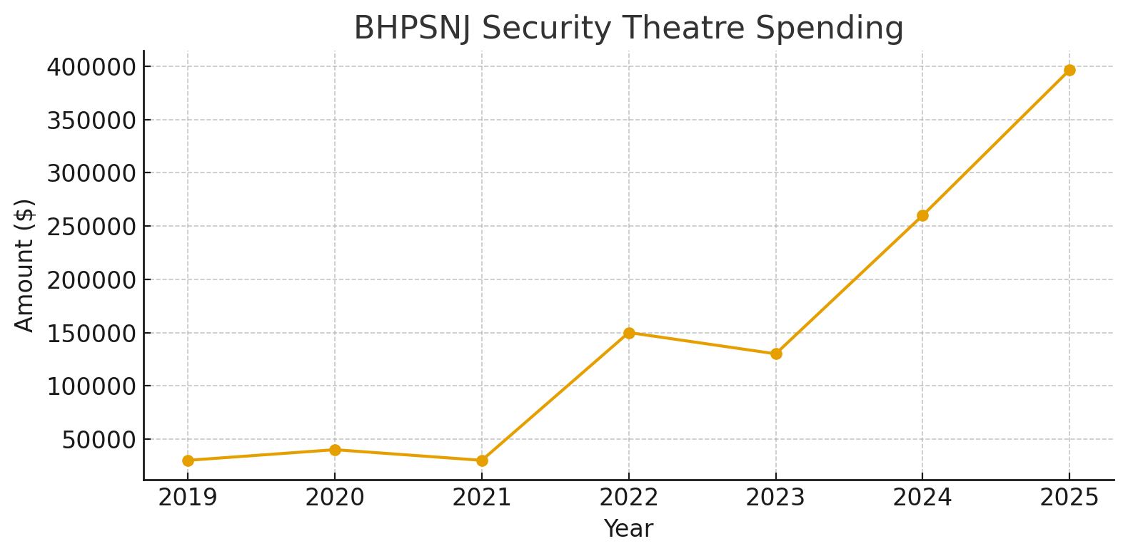
Part 5
The True Cost of School Security
- Breaks down what districts actually spend on security.
- Separates visible costs from hidden budget drivers.
- Tracks how security spending has shifted over time.
- Shows how these costs fit into total district spending.
New
Berkeley Heights ACFR Snapshots
- A visual, shareable set of charts using Berkeley Heights as the case study.
- Shows how ACFR data can help families and students ask better budget questions.
- Connects spending trends back to priorities and outcomes.
- Built for quick review and easy sharing.
nj21st.com (with the exception of featured images) is licensed under CC BY-NC-SA 4.0![]()
![]()
![]()
![]()